
Ad making is a weird thing. I have no training in graphic design and no background in marketing. But from experience both as a consumer and as a person who used to watch people debate the merits of assorted publications and ad copy, a few basic things should apply:
- It should be clear - who and what's being advertised, where to get it, etc. If a person seeing an ad can't easily answer "who, what, where", then something is likely wrong.
- It should be clean - clutter obscures the information, and the key to an ad is getting across a specific bit of information to entice people into clicking through to the shop. This means text should be as succinct as possible and images shouldn't obscure what there is of text. And images should be clearly comprehensible when it's tiny because dude, I'm not getting any younger and my screen resolution is set pretty fine. Folded into this is the fact that the text should be proof read and free of errors, and the images should be free of random artifacts and obvious cut and paste markers.
- It should be attractive for the target audience - which is to say if you're advertising to people who are interested in fake blood and gore, then fake blood and gore is the way to go. I'm not, so no big, splashy zombie parties in my ads. I'm selling yarn and stitch markers, so my ads figure yarn or stitch markers, and I try to go for pictures that will tantalize.
- It should make sense - And by this I mean all aspects of it. There's got to be some sort of internal cohesion, and random things just popping up don't "make sense".
 ETA:
ETA: 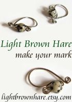
(eta: the spacing was bothering me, and the smallness of the foregrounded widget.)
Now, it's kind of chilly in color which is potentially off putting, but I decided to keep it because it's a counterpoint to the warmth of the tiger eye ad. But look at all that white space! I think I could have tweaked the spacing of the words a little bit more to make the white space a little more emphatic, but I'm happy enough with it as it is.
I think it's a reaction to some of the ads I've seen. It's almost monochrome, especially in comparison to some of the really busy and colorful ads where there's no place for the eye to rest, and where there's white text on a multicolor background of so many different values that it's hard to read.
Then I made this one:
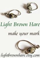
#1

... Yeah. After the minimalist, practically industrial one for the dalmatian jasper, this felt too similar and too spare. I like it, but it's not contrasty enough for an ad that will run in the same space. I want it to pop after all. So I tried these two:
#2
 ; #3
; #3
And it's clear in #3 that the urge for minimalism was warring with the need for clarity. It felt like there was too much tension in the second one, with the words scrunched up into the bottom half. BUT, and here's the big qualifier in all of this, it's not really that cramped. There's still plenty of white space in the ad, it's just that the curves of the wire and the shadows busy it up. That and anything would be busy next to the dalmatian jasper ad. I could reverse the placement of the shop name with the tag line, but that would do some things with compartmentalization that I'm not sure I like. Aesthetics, like I said.
Anyway, I'm going with #2, and all in all I'm pretty pleased with what I managed to turn out because I kept to what I believe is necessary for a good ad. Namely, the shop name is prominent, the shop url is clear, the amount of text is limited and easy to read while still relevant, the pictures are clear and self explanatory, the images are attractive and I was very careful to remove all cut and paste artifacts, and my greatest point of pride, all the images are on the same visual plane.
Things randomly scattered about in an image without any cohesion is one of my biggest beefs. I hate it when things have shadows going in different directions and they all look slapped together like it's a zero gravity well. So being able to preserve the perspective and plane of these very spare images really pleased me. This was achieved by the simple expedient of culling all the images from the same source photograph, and keeping the general relationship the same. So, foregrounded objects are bigger and are still in the foreground, etc. This means all the shadows are going in the same direction and nothing feels like it's floating separately from the other items. I think this creates a much more pleasant visual whole. It's not a bunch of markers floating in space. It's a bunch of markers scattered over a surface, which indeed they were, just not in that arrangement. I used the eraser and smudge tools a lot to clean things up.
These are just the notebook ads, I also did banner ads which were easier because they're bigger. It doesn't escape me that I spent all afternoon working on something that would take a graphic artist very little time at all to throw together. But I'm learning the ins and outs of GIMP and really starting to appreciate what I can do with it, and how some of its functionality is easier to use than PSE which is what I used to use. And I'm getting better at knowing what I need from my picture taking, which is good. There's nothing quite as frustrating as taking pictures for hours and having little to nothing that's usable to show for it.
... I swear this entry was interesting to me when I was thinking about it. I promise to talk fiber soon.

No comments:
Post a Comment