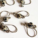
Ad making is a weird thing. I have no training in graphic design and no background in marketing. But from experience both as a consumer and as a person who used to watch people debate the merits of assorted publications and ad copy, a few basic things should apply:
- It should be clear - who and what's being advertised, where to get it, etc. If a person seeing an ad can't easily answer "who, what, where", then something is likely wrong.
- It should be clean - clutter obscures the information, and the key to an ad is getting across a specific bit of information to entice people into clicking through to the shop. This means text should be as succinct as possible and images shouldn't obscure what there is of text. And images should be clearly comprehensible when it's tiny because dude, I'm not getting any younger and my screen resolution is set pretty fine. Folded into this is the fact that the text should be proof read and free of errors, and the images should be free of random artifacts and obvious cut and paste markers.
- It should be attractive for the target audience - which is to say if you're advertising to people who are interested in fake blood and gore, then fake blood and gore is the way to go. I'm not, so no big, splashy zombie parties in my ads. I'm selling yarn and stitch markers, so my ads figure yarn or stitch markers, and I try to go for pictures that will tantalize.
- It should make sense - And by this I mean all aspects of it. There's got to be some sort of internal cohesion, and random things just popping up don't "make sense".
 ETA:
ETA: 
(eta: the spacing was bothering me, and the smallness of the foregrounded widget.)
Now, it's kind of chilly in color which is potentially off putting, but I decided to keep it because it's a counterpoint to the warmth of the tiger eye ad. But look at all that white space! I think I could have tweaked the spacing of the words a little bit more to make the white space a little more emphatic, but I'm happy enough with it as it is.


